The Story Behind Fidel API's Rebrand
It’s been quite the week for Fidel API. Announcing a Series B at the end of Q2 was the opening of a new chapter - an evolutionary step forward for the business. While Fidel API’s audience will rarely hear from the in-house design team, you’ll see our work everywhere. As the first designer and one of the first employees at Fidel API, to now heading up the team, I’ve been privileged to have had a hand in the very first iterations of the logo, right through to today, with this rebranding project.
The term ‘rebrand’ might suggest we’ve thrown out the old for the new, but that’s not the case. The design team wanted to reimagine the 'face' of Fidel API - one that represented the progress and transition that’s been made, especially in the last year. It’s been a long journey - from the days when there were barely ten people in a tiny office - to now, with 110+ people working with clients all over the world, helping to fulfill Fidel API’s mission to make money programmable.
I want to take you on a brief journey of how the Product and Design teams completed this makeover process, from logo conceptualization to launching the refreshed Fidel API website.
Front And Center
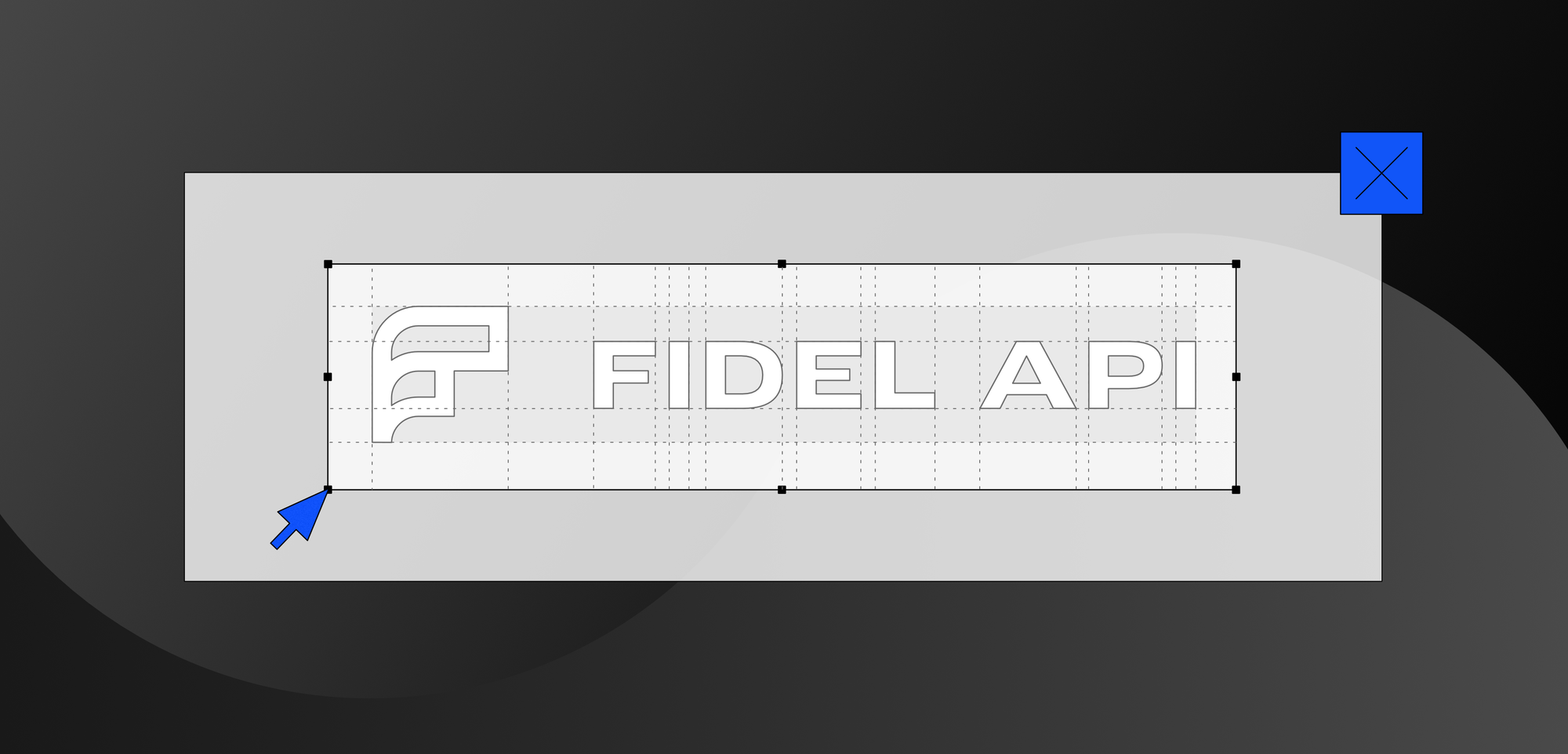
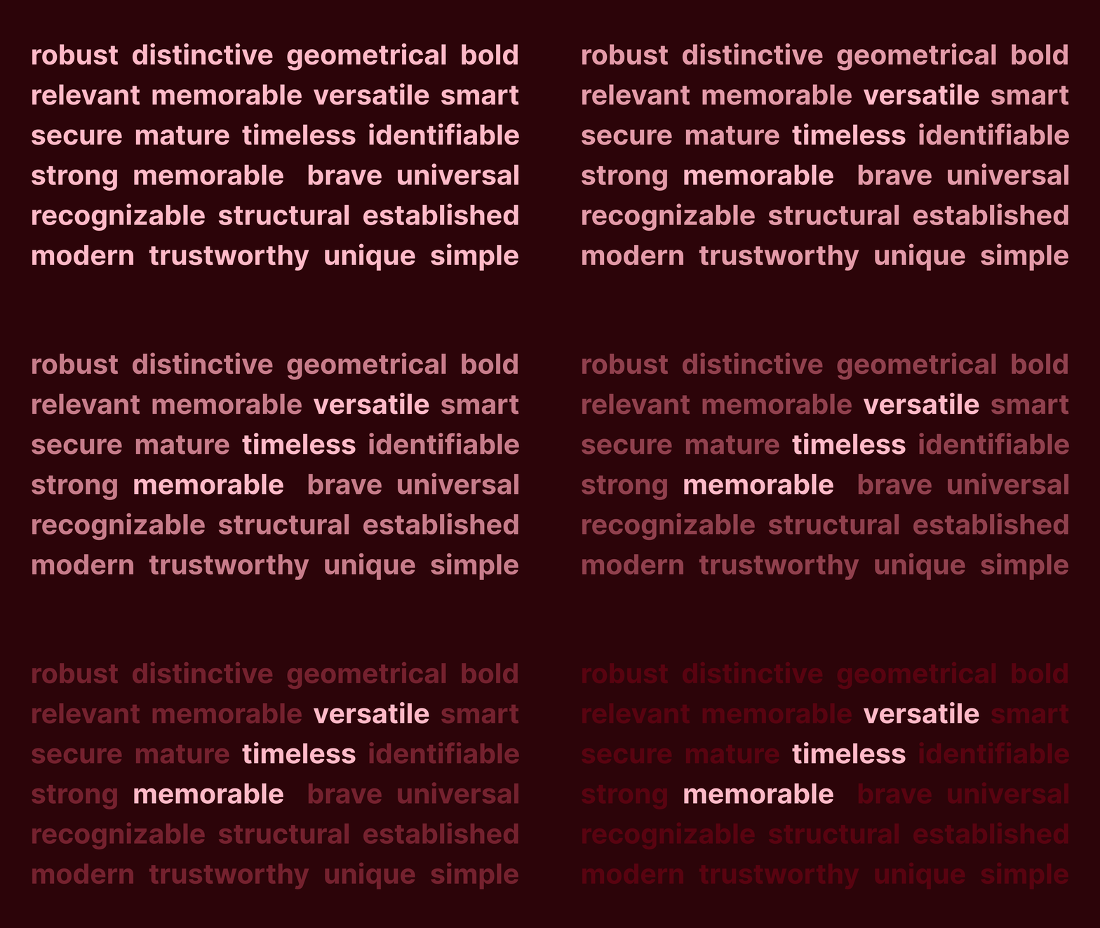
The logo matters. A lot. Before even starting to come up with rough ideas, we decided early on to reflect on what Fidel API is today and where it’s going. If we were going to create a new logo, it needed to be versatile, memorable, and timeless.
The ‘F’ of Fidel API has always been a feature that we felt could be called out more, so we wanted a new icon as part of the logo. The visual language of a logo is key to communicating certain perceptions of a brand, as well. A series of concepts were produced, each playing with the idea of building, data flowing, connecting, and evolving or scaling. That kind of visual language spoke to the true core of Fidel API’s purpose and mission. Below were some of the ideas we developed:
After deliberation, this option stood out among all the others.
It feels visually memorable and demonstrated a smooth, ‘stacked and flowing’ structure. This was an intentional decision, implying the way Fidel API tools layer on top of other platforms and major card networks. The icon was also striking and recognizable. It had a certain flourish that the eye notices immediately when looking at the logo in full. Of all the concepts put together, this one felt like it had the most potential and promise. We can't say whether it's timeless or not just yet - check back in a few years' time!

Considering Fonts And Colors
We wanted to deliver a complete revamp, and so we decided to refresh both the color palette and add a new typeface combination - Fidel API now uses Aeonik font for all titles and Inter font for all body copy. For colors, we opted to stay relatively loyal to the color scheme we’d applied previously. We applied small updates to the primary colors (black, blue, and white) rather than overhauling entirely, and added a few new secondary colors, to provide more flexibility when producing things like Fidel API merch.
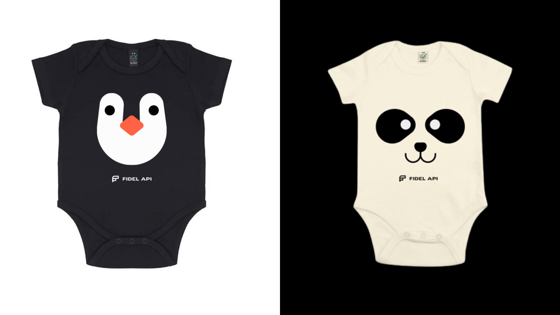
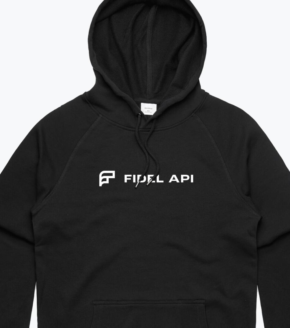
With the colors chosen and Fidel API icon chosen, embroidering logos would be easier now, and we could try out new printing techniques like embossing. With that need for adaptability in mind, we opted to remain flexible and stick to a largely monochrome palette for the time being, while leaving the door open to introduce new colors in the future.

A New Home
The final facet of the rebranding would be the overhaul of some of the main areas of the website, including the homepage and product pages. Of the number of factors that went into this, three key things had to be achieved:
Better distinguish the core API products: Select Transactions and Transaction Stream, and make it easy to distinguish those differences.
Demonstrate Fidel API’s commitment to security and compliance with more detail and documentation.
Better communicate the many components of information and engineering that come together to create a solution for Fidel API clients
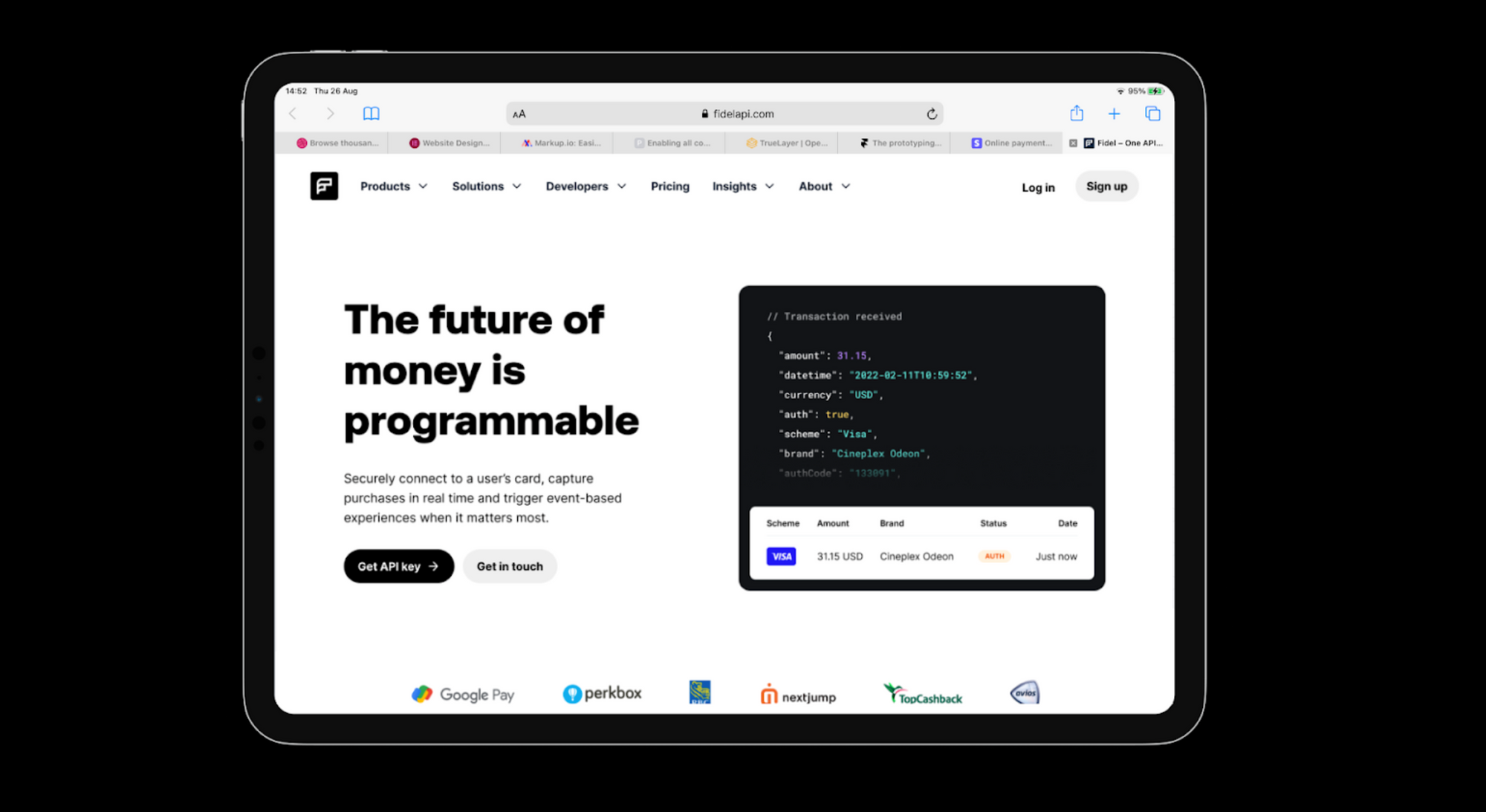
The visual language was also geared towards portraying the aggregation and enrichment aspects of what Fidel API products do. We wanted to communicate the sense of taking many diffuse elements and building a new outcome, which inspired the visual graphics you see on the Product pages now. The goal of the site revamp as a whole was to make it easier, more intuitive and satisfying to learn about Fidel API technology - and feel empowered to connect with the team from a position of clarity and understanding.
Onwards and Upwards
All in all, all the designers involved in this rebrand are delighted with the new look. As the new face of the business, the team feels it accurately represents the Fidel API of today, tomorrow, and beyond. The hope is that the future visitors to the website love the new look as much as we do!
Fidel API’s team is growing (including in design!) - check out all open roles here.
